We have been working all year to replatform our websites at work from Drupal to WordPress. We decided to go with WordPress for many reasons, one of the biggest being its admin UI. The WordPress edit screen, especially when compared to the Drupal edit screen, has historically been intuitive and preferred by content editors. In fact, many of my clients in the past have asked to switch their websites from Drupal (or similarly complex systems) to WordPress because of WordPress’s UI advantages.
WordPress 5.0 and Gutenberg
The recent updates to the upcoming WordPress 5.0 release, specifically the new Gutenberg editor, appears to be undoing these advantages. I have been working with Gutenberg in development since the start of our replatforming project. The UI has so much promise in terms of allowing editors to add, remove, and rearrange content blocks on pages. The UI is clunky, but it has been getting so much better over the course of this year.
However, I say this as a (mostly) fully abled user. (I mean, I have been having age-related sight issues lately, but otherwise, I am fully capable of navigating the web without assistive technology.)
Gutenberg and accessibility
Gutenberg has been controversial from its inception. However, Rian Rietveld’s recent blog post about her resignation from the WordPress accessibility team has brought Gutenberg’s accessibility issues into the spotlight. There seems to be a myriad of issues here:
- A lack of development education about accessible development.
- Fundamental flaws in the editor’s UI design.
- A lack of governance around enforcing WordPress accessible coding standards.
There are calls from the community to perform an accessibility audit on the Gutenberg editor. However, regardless of whether the audit will happen or not, it seems that accessibility concerns will not delay the release of 5.0. (I mean, really. Really?)
Curiosity is getting the better of me
All of this talk about Gutenberg’s lack of accessibility has me very curious as to how bad the editor is. So, I decided to take a quick peek.
My environment
I am running this very informal audit on my work machine, which is a MacBook Pro, running OS 10.14 (Mojave). My web browser of choice is Chrome, which as of this writing, is up-to-date at version 69.0.3497.100.
My development environment is running WordPress 4.9.8, with the Gutenberg plugin, version 3.9.0. Both core WordPress and the plugin are up-to-date as of this writing. For the purposes of this test, I ensured that Gutenberg is the only installed and activated plugin.
Automated testing
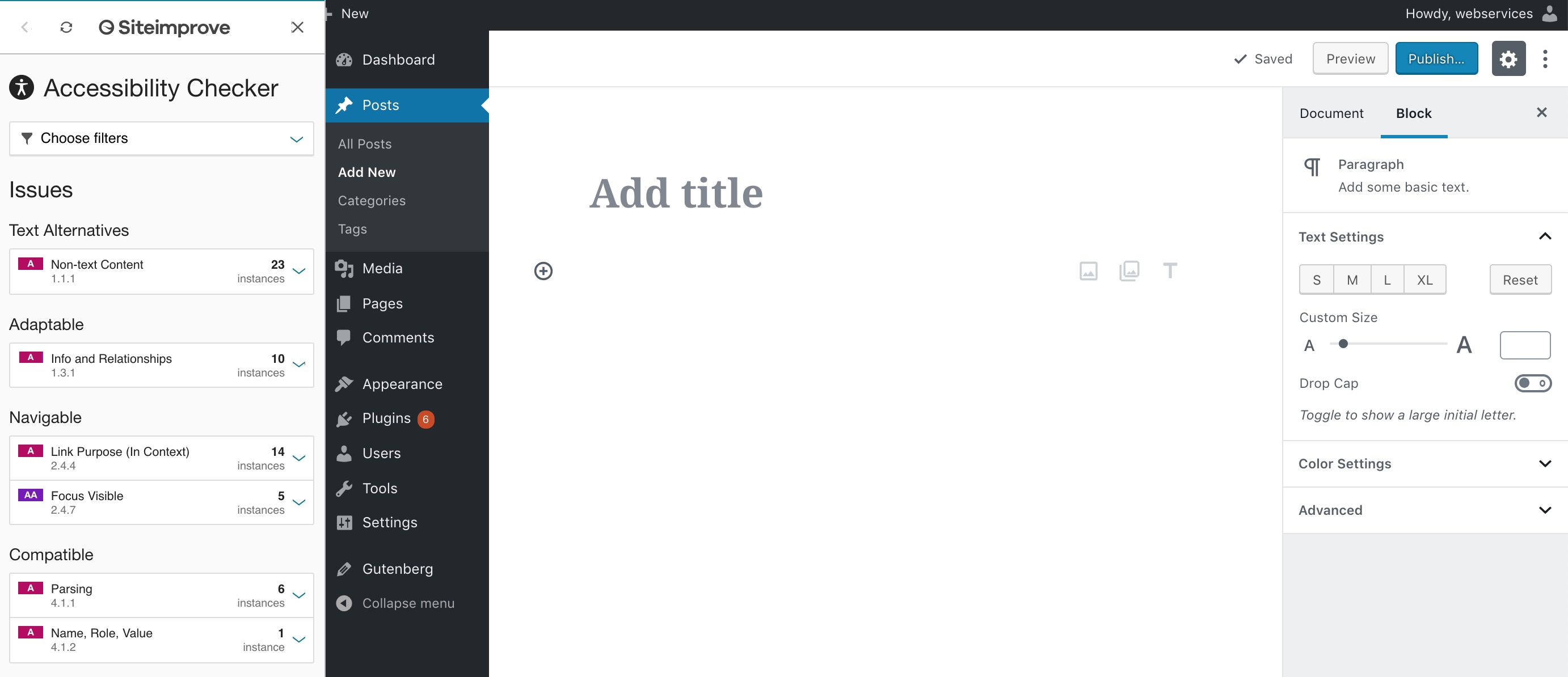
I added a new post to my site and then ran the Siteimprove Accessibility Checker Chrome extension on the page to search for all A and AA level issues.

When I added a paragraph block to the page, Siteimprove found 54 instances of level A issues and 5 instances of level AA issues.
Level A issues
There were 5 types of level A issues:
- 1.1.1 Non-text content (23 instances)
- All of these instances were hidden SVG images with no alt text.
- 1.3.1 Info and relationships (10 instances)
- 1 instance was regarding the use of the
<b>tag to format text. I do not view this as necessarily an issue because this tag has valid semantic meaning. - 6 instances of element IDs not being unique. This is definitely a big issue.
- 3 instances of content outside of landmarks. This is also definitely an issue, especially for screen reader users who rely on landmarks to navigate the page.
- 1 instance was regarding the use of the
- 2.4.4 Link Purpose (in Context) (14 instances)
- All of these instances involve the same link text being used for multiple different destinations. This is an issue for screen reader users, who can view a list of links out of context and will expect that multiple links with the same title to go to the same place.
- 4.1.1 Parsing (6 instances)
- This is a duplicate issue of the 6 instances of non-unique IDs that were flagged above.
- 4.1.2 Name, Role, Value (1 instance)
- This instance is on the text box used to enter paragraph content. This text box is using the
aria-expandedattribute, which is not appropriate for text boxes
- This instance is on the text box used to enter paragraph content. This text box is using the
Level AA issues
There was only 1 type of level AA issue that was flagged:
- 2.4.7 Focus visible (5 instances)
- All of these instances involved elements not being highlighted on focus. This is a huge issue for keyboard users, who rely on these highlights to know where they are on the page.
What if I do something more complicated?
I ran the checker after adding other kinds of content blocks, such as the Image block. In all cases, I found the same kinds of issues, but differing numbers of instances, depending on the block.
Manual testing with a keyboard
Automated testing is great for a start, but a real accessibility test involves attempting to navigate a page as a human using assistive technology. My first such test was as a keyboard user.
I decided to attempt to create a post with a paragraph and an image using only my keyboard. I started the test already on the “new post” page. My goal was to add a paragraph block and an image, and then save the page using only my keyboard.
Adding a page title
I started tabbing and immediately saw the skip links. Great! I skipped to the toolbar. At first, I had no idea where I was because nothing had focus.
After tabbing once, I realized that I was on the horizontal bar at the very top of the screen. I kept tabbing through that bar and eventually tabbed through to the “Add block” button.
However, I wanted to add a title first, so I kept tabbing until I got to the title input area.
And… I successfully added a title! Great!
Adding a paragraph
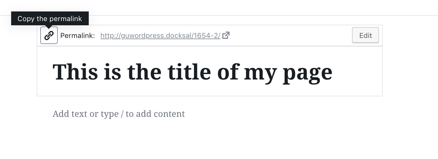
I kept tabbing and for some reason, tabbed up the page to the section where I can copy the permalink. This section is above the page title input, but, since I tabbed to it after the page title, it must exist after it in the DOM. Not unusable, but definitely strange.

I lost focus for a tab, but did get to the part of the block where I could enter paragraph text. And… I successfully added a paragraph!
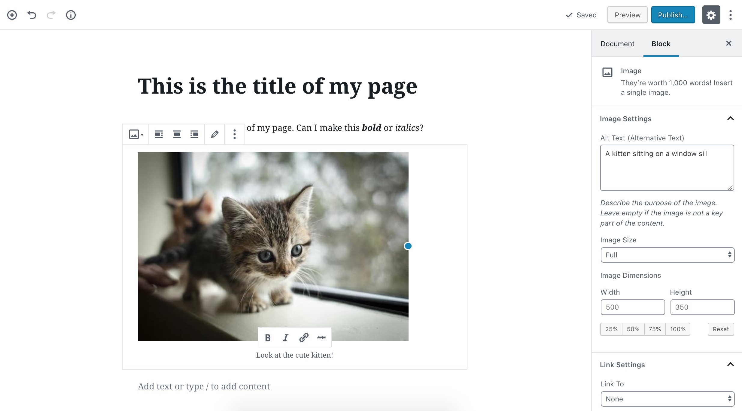
However, even though I saw the formatting toolbar for the paragraph (where I can align the text and bold/italicize, etc), the toolbar disappeared as soon as I started typing. Moreover, when the toolbar was visible, I could not figure out how to tab into it to actually use any of those formatting functions.
I tabbed back and forth several times to try to figure it out. Eventually, I figured out that if I tabbed backwards into the page title, then forwards again, I was able to tab into the toolbar. I could align the text left, right, or center at that point.
I was only able to somewhat able to add bold or italicized text, but the bold/italicized text was forced to the start of the paragraph content because, when I tabbed to the toolbar, my cursor (for whatever reason) moved to the start of the paragraph content (even if it was in the middle of the content). I was able to select and bold or italicize specific words in my content, using Command-B or Command-I.
Another weird thing I discovered was that I could tab backwards from the paragraph block to the page title input, skipping the permalink section. However, when I tabbed forwards from the page, I tabbed into the permalink section first, before getting back to the paragraph.
Adding the image block
The first step to adding an image was adding the image block. That was… special.
A new paragraph block was created after I pressed Enter after my first paragraph block. That would be super convenient if I wanted another paragraph. I was able to easily tab into the section of “most used” (or “recently used?”) Gutenberg block buttons above the new paragraph block. One of these block buttons was for the Image block, but since the buttons in that section changes, I viewed that as somewhat cheating.
So, I decided to try to add the Image block using the regular “Add Block” button. But first, I had to get to that button.
There are actually 2 “Add Block” buttons: one to the left of the currently selected block and one at the very top of the edit screen. I went for the one on the selected block first. I was able to tab to that button, but after tabbing through the “most used” block buttons. That worked, but it was an odd experience, since I expected to tab between elements from left to right, top to bottom.

Once I got to the “Add block” button, I successfully searched for the image block and added it to the page.
Adding an image
It took quite a bit of tabbing to get to the “Media Library” button inside the image block. (I first had to tab through the block’s toolbar, which did persist, unlike the paragraph block.)
Adding an image via the Media Library was very straight forward. I was able to tab to my image, select it using Enter, edit any caption or alt text, and add the image.
But (and this is a huge “but”), the image block has a lot of options in its inspector control panel. I have no idea how to tab to those options. I can see them, but as soon as I tab through the image block, I tabbed through the next element in my post (another paragraph block).

After that last block, I was able to tab into the inspector panel, but it was the inspector for the paragraph block at the end of my post, not the image block in the middle of my post. I was unable to figure out how to tab to the inspector controls of any block that was not the last block of the post.
Publishing the page
I am done with trying to figure out the options for my image, so I am just going to publish this post. I tabbed out of the last block of my post and discovered a skip link labelled “Open publish panel”. Well, now. That is convenient!
I clicked on that skip link and the publish panel opened. The “Publish” button had focus and was highlighted (though, the highlight blended into the button). I pressed enter and – voila! – my post was published!
I lost focus after the post was published, but one forward tab took me to the “Close panel” button for the publish panel. I lost focus again when I closed that panel.
At this point, I wanted to view my new post. It took a lot of finagling with forward and backward tabbing to figure out how to get to the “View Post” link at the top of the page, but eventually I got there.
Screen reader testing?
I really should test this process using a screen reader too, but, frankly, just testing with the keyboard was a lot of work. If time allows later (soon?), I will run the same test with a screen reader and post about it here.
Conclusions (so far)
It appears the Gutenberg did think about some accessibility features, but it is very clear that no complete accessibility testing was performed. The points of frustration for me in this short experiment where:
- Tabbing did not necessarily follow the logical sequence of top to bottom, left to right. The order of tabbable elements appeared to skip around a bit, mostly when new items, like toolbars, became visible.
- Toolbars were pretty usable when they were visible, but the fact that the paragraph toolbar kept disappearing on me was very frustrating.
- The fact that I was completely unable to tab into the inspector panel options for all blocks that were not the last block on the page is a huge issue. IMHO, that is a blocking issue.
The community has also logged a bunch of Gutenberg accessibility issues and I suspect this list will grow once (if) an accessibility audit is performed.
Ultimately, I like Gutenberg. Well, really, I like the idea of Gutenberg. There are definitely quirks in the UI for all users and very definitely issues for users with accessibility needs. I hope the editor gets better, but it seems that the fixes will require large systemic changes, which will take a lot of time. I would love it if Gutenberg launched after fixing these issues, at the very least to get the editor to WCAG A compliance before launch.