One of my biggest pet peeves these days stems around blog or news sites. Your typical blog front page will include a bunch of articles. Each article has a title, a date, maybe an image, and a small bit of “teaser” text from the article itself. The goal is to get the reader to choose a specific article and click to read the entire article. To make that goal abundantly clear, each article on this front page includes a link or a button that usually says “Read More” (or something similar).
Sigh. “Read More.” In context, this link makes sense. If we have a page that includes an article blurb about cats and an article blurb about dogs, I can click on the “Read More” link next to the cat article to read more about cats or the “Read More” link next to the dog article to read more about dogs.
But what if I can’t see the page?
Let’s say that instead of looking at the page, I am reading the page using a screen reader. I could read the content on the page sequentially.
However, I can also pull up a list of all of the links on the page and figure out where I want to navigate to next based on this links list.
The links list is content out of context.
The existence of this links list is the entire basis of my “Read More” pet peeve. All of these “Read More” links are now a problem because they have redundant link text, but they go to different locations.
While there is enough context on the page itself to establish which “Read More” link belongs to which article, that context only exists when a user is looking at the page layout or reading the content of the page sequentially. The links by themselves do not provide this context.
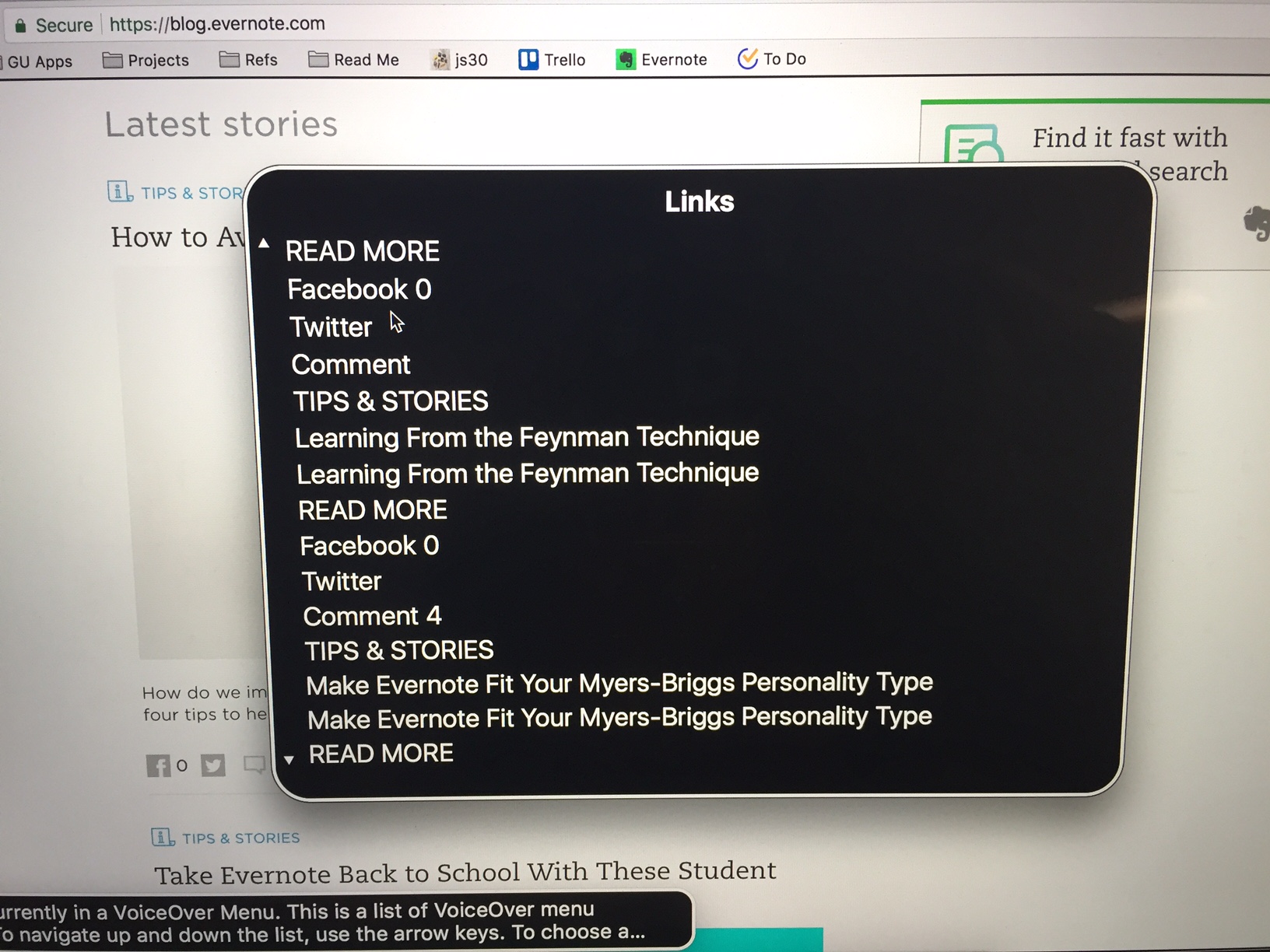
Let’s check out an example from the Evernote blog:

This is just part of the links list, but we can already see that there are three different “READ MORE” links. Read more what? Am I reading more of the same article a bunch of times? Probably not. In that case, which of these “Read More” links go to which article? Without the context of the page, there is no way to know.
How is this links list generated?
Every screen reader generates a links list from all of the <a> tags in the HTML for the page. The links list shows these links in order and, by default, labels them according to their link text. So, for example, if the HTML looks like this:
1
2
3
4
5
6
7
8
<p>My first article</p>
<a href="/article1">Read More</a>

<p>My second article</p>
<a href="/article2">Read More</a>

<p>My third article</p>
<a href="/article3">Read More</a>
Then the screen reader’s links list will look like this:
1
2
3
Read More
Read More
Read More
Helpful, right?
A better links list
Alternatively, I can add the aria-label attribute to these links to give screen readers more specific information about each link. So, the previous example can be fixed like this:
1
2
3
4
5
6
7
8
<p>My first article</p>
<a href="/article1" aria-label="Read more about my first article">Read More</a>

<p>My second article</p>
<a href="/article2" aria-label="Read more about my second article">Read More</a>

<p>My third article</p>
<a href="/article3" aria-label="Read more about my third article">Read More</a>
As a result, the new and improved links list will look like this:
1
2
3
Read more about my first article
Read more about my second article
Read more about my third article
Need more information?
If you would like to read more about the WCAG requirements around unique link text, WCAG Success Criterion 2.4.9 addresses this in more detail. This particular issue is a AAA issue; however it is still an important one to address for screen reader users.