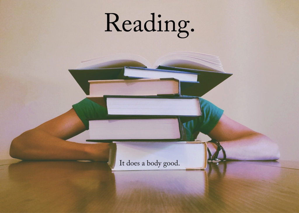
I can’t believe it is 2017 and I have to say this, but stop putting text in your #$@&*% images!!!
It boggles my mind that content editors and website managers think this is still OK, but I see it everywhere, so apparently this still needs to be spelled out for you all.
Images with text look like crap on small screens
A giant poster with text and photos may look fantastic on your 1600×1200 screen, but try loading this on your iPhone 5.

Yes, the image will scale down to fit your 320px wide screen, but I dare you to read all of of the image text without pinching to zoom in. Maybe all of you who have 20/15 vision, but I’m certainly not in that group, for one.
Images with text are bad for accessibility
Speaking of people with imperfect vision, users with low- or no- vision use a screen reader to access your site. Screen readers go through a web page’s code and read all of visible content on that page.
An image does not have machine readable content, so screen readers need to rely on the image’s alt text in the HTML to completely and accurately describe the image. For the image above, that alt text would have convey both the text in the image as well as the content of the image itself. For example:
1
<img src="reading-poster.jpg" alt="Photo of a person sitting at a table behind a pile of books. The top book is open. Text on top of the image reads: Reading. It does a body good.">
That’s a lot of alt text. Arguably too much. Alt text should be descriptive, but it should not be a thesis.
Separating your image and text is a win-win for everyone!
The people who are still putting text in images are clearly coming from an age where print and the web need to look exactly alike in all cases.
Again, folks — it’s 2017.
Print is not the web. The web is not print. Moreover, the web does not look (or sound) the same for everyone. We as website owners and content creators need to be as flexible and accommodating to our users as possible if we want them to read the content we are giving them.
Separating text from image allows both the text and image to be responsive and accessible. For example:
1
2
3
4
5
<section class="poster">
  <img src="books.jpg" alt="Person sitting at a table behind a pile of books. The top book is open.">
  <p class="headline">Reading.</p>
  <p class="tagline">It does a body good.</p>
</section>
Humans can read this. Screen readers can read this. With a few media queries, humans with tiny phones can read this. Everyone wins!
Hopefully I convinced you.
For those of you who remain unconvinced, I will be starting an accessibility wall of shame.